
A fan chart is a type of data visualization that represents a range of possible outcomes and their probabilities. It is particularly useful for illustrating forecast uncertainty. The chart consists of a series of lines or bands that fan out from a central point, representing different confidence intervals. The wider the bands, the greater the uncertainty in the projection.
Fan charts are commonly used in financial and economic contexts to depict the variability in projections such as inflation rates, GDP growth, and other key economic indicators. They offer a clear visual representation of potential future outcomes, helping policymakers and analysts make informed decisions based on the range of possible scenarios.
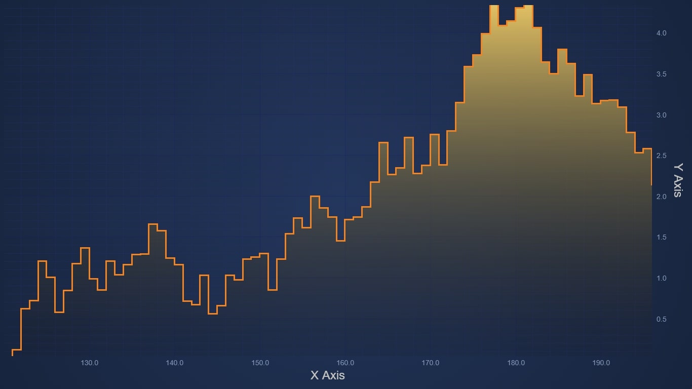
The Mechanics of Fan Charts
According to https://demo.scichart.com/javascript/fan-chart, creating a fan chart involves several steps, starting with gathering historical data and then using statistical methods to forecast future values. The forecasted values are typically represented as a central estimate (such as a mean or median) and a range of possible outcomes around this estimate. These outcomes are often divided into confidence intervals, such as 50%, 75%, and 95%, each represented by a different band on the chart.
The central band usually represents the most likely range of outcomes, while the outer bands illustrate less probable scenarios. This gradient of probability is what gives the fan chart its distinctive “fan” appearance.
Applications of Fan Charts
Fan charts have found a broad range of applications across various sectors:
Economic Forecasting: One of the most notable uses of fan charts is in economic forecasting. Central banks, such as the Bank of England, use fan charts to communicate the uncertainty surrounding economic projections, including inflation and GDP growth. This helps in setting expectations for the public and policymakers about the possible range of future economic conditions.
Financial Analysis: In the financial sector, fan charts are used to predict asset prices, interest rates, and other financial metrics. They provide a visual representation of the potential variability in these metrics, which is crucial for risk management and investment decision-making.
Climate Modeling: Fan charts are also employed in climate science to project future temperature changes and other environmental variables. They help in illustrating the range of possible climate scenarios, which is essential for planning and policy formulation in response to climate change.
Advantages of Fan Charts
The primary advantage of fan charts lies in their ability to convey complex statistical information in an accessible format. By visualizing a range of potential outcomes, fan charts help users understand the uncertainty inherent in forecasts and make more informed decisions. This is particularly valuable in situations where precise predictions are difficult or impossible to make.
Another significant benefit is the ability to update fan charts as new data becomes available. This allows for real-time adjustments to forecasts and helps maintain accuracy over time. The dynamic nature of fan charts makes them a versatile tool for ongoing data analysis and decision-making processes.
Challenges and Considerations
Despite their advantages, fan charts also come with certain challenges. One of the main issues is the complexity involved in creating accurate forecasts and representing them visually. This requires a deep understanding of statistical methods and the ability to handle large datasets. Additionally, interpreting fan charts correctly requires some level of statistical literacy, which may not be common among all users.
Another challenge is the potential for misinterpretation. The bands in a fan chart represent probabilities, not certainties, and it’s crucial for users to understand this distinction. Misinterpreting the data could lead to overconfidence in the central estimates or underestimation of the risks associated with the outer bands.
Creating Fan Charts with Charting Libraries
For developers interested in creating fan charts, JavaScript offers a robust platform for building interactive and responsive visualizations. JavaScript libraries provide powerful tools for developing high-performance fan charts that can handle large datasets and offer real-time interactivity.
Fan chart demos highlight the capabilities of JavaScript in creating detailed and dynamic charts. The library supports a range of customization options, including different color schemes, axis configurations, and interaction modes. This allows developers to create charts that are not only functional but also aesthetically pleasing and tailored to specific use cases.
One of the key features of charting libraries is their ability to handle large volumes of data efficiently. This is crucial for applications like financial analysis and climate modeling, where datasets can be extensive and complex. Performance optimization ensures that charts remain responsive and interactive even with large datasets, providing a seamless user experience.
For those new to charting libraries, the getting started guide offers a comprehensive introduction to the library and step-by-step instructions for creating various types of charts, including fan charts. The guide covers everything from setting up the development environment to deploying the charts on a web platform, making it an invaluable resource for developers.
Conclusion
Fan charts are a powerful tool for visualizing uncertainty and making informed decisions based on probabilistic forecasts. Their applications in economic forecasting, financial analysis, and climate modeling underscore their versatility and importance in various fields. With the help of advanced JavaScript libraries like SciChart, developers can create high-quality fan charts that are both informative and interactive.
As data visualization continues to evolve, tools like fan charts will play an increasingly important role in helping users understand complex data and make better decisions. Whether you are a policymaker, financial analyst, or climate scientist, mastering the use of fan charts can provide valuable insights into the future and help navigate the uncertainties that lie ahead.